Agape NYC
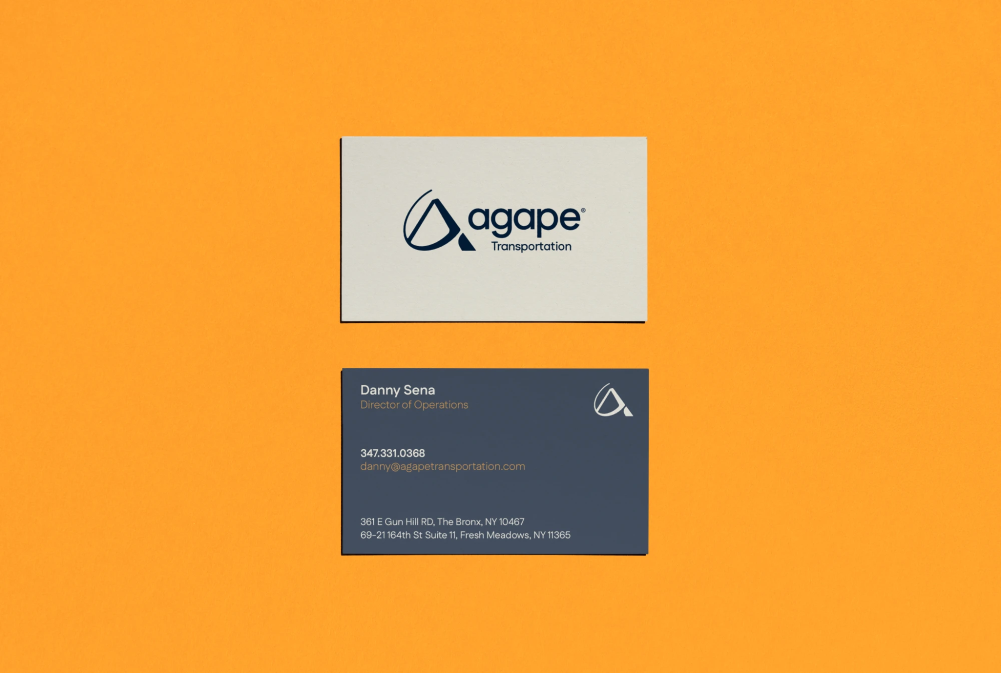
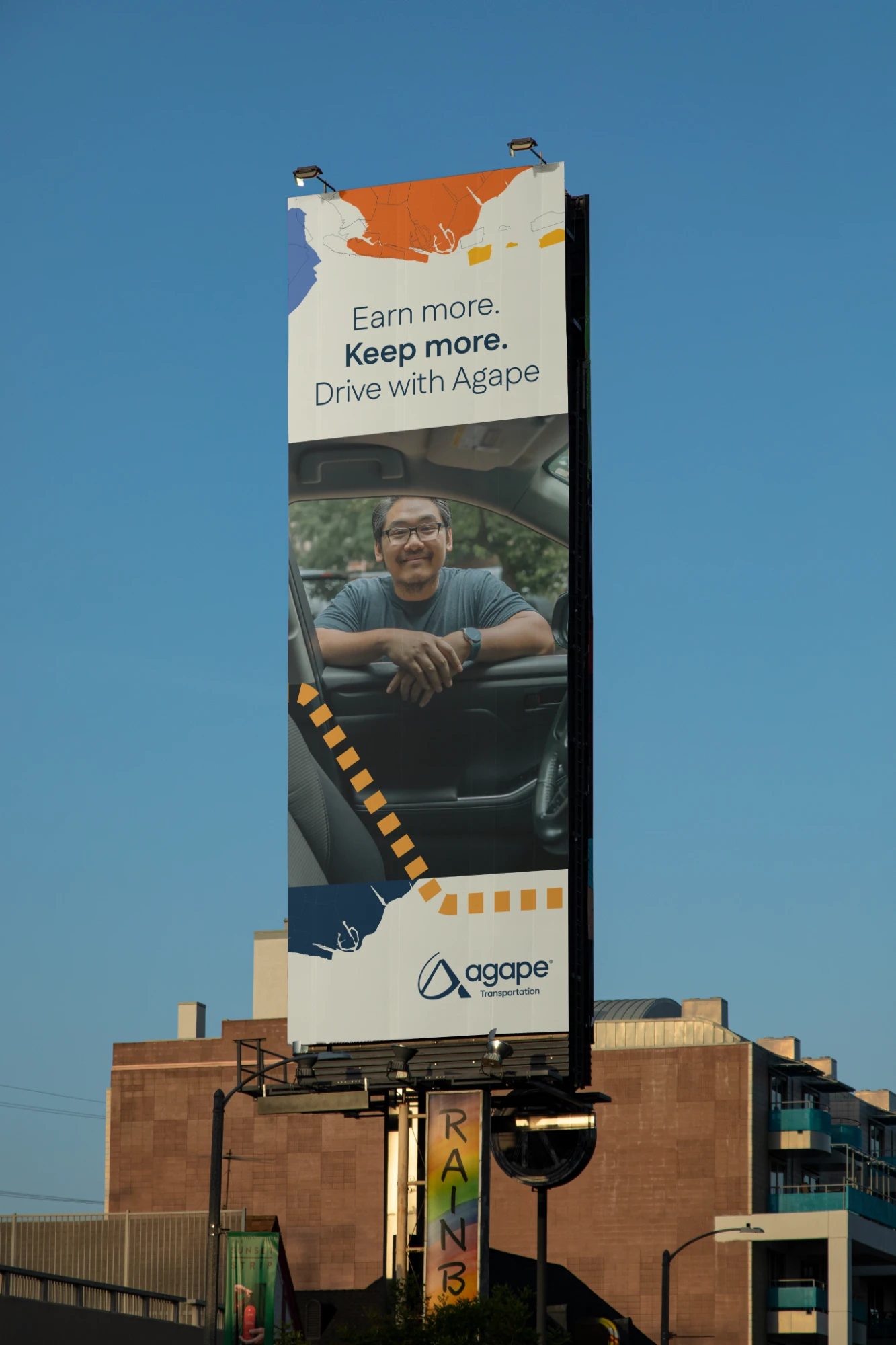
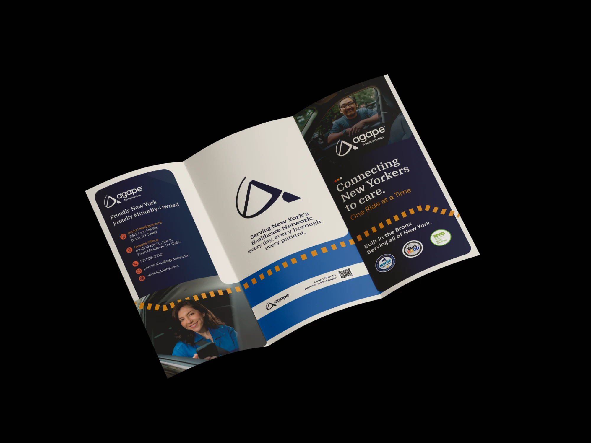
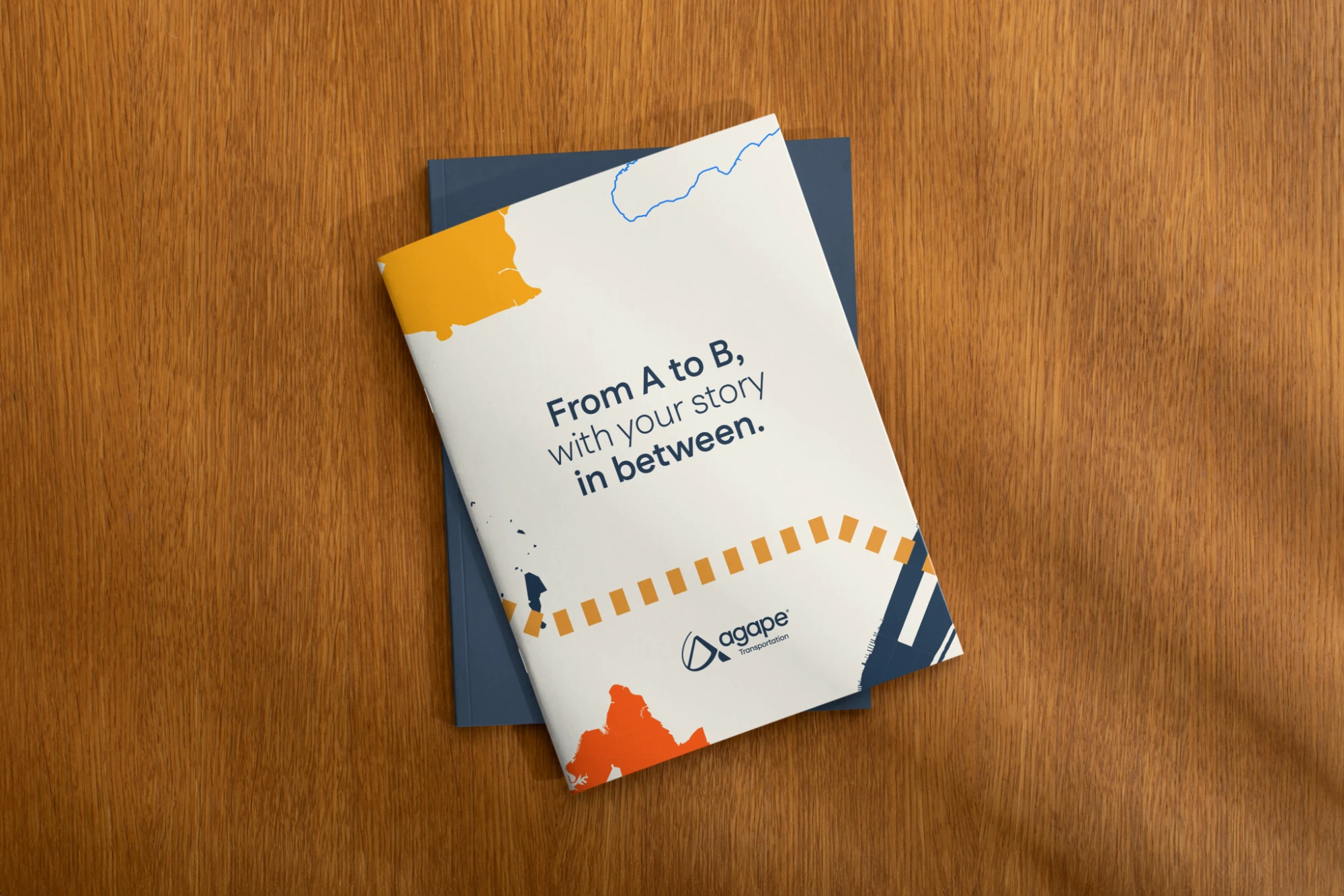
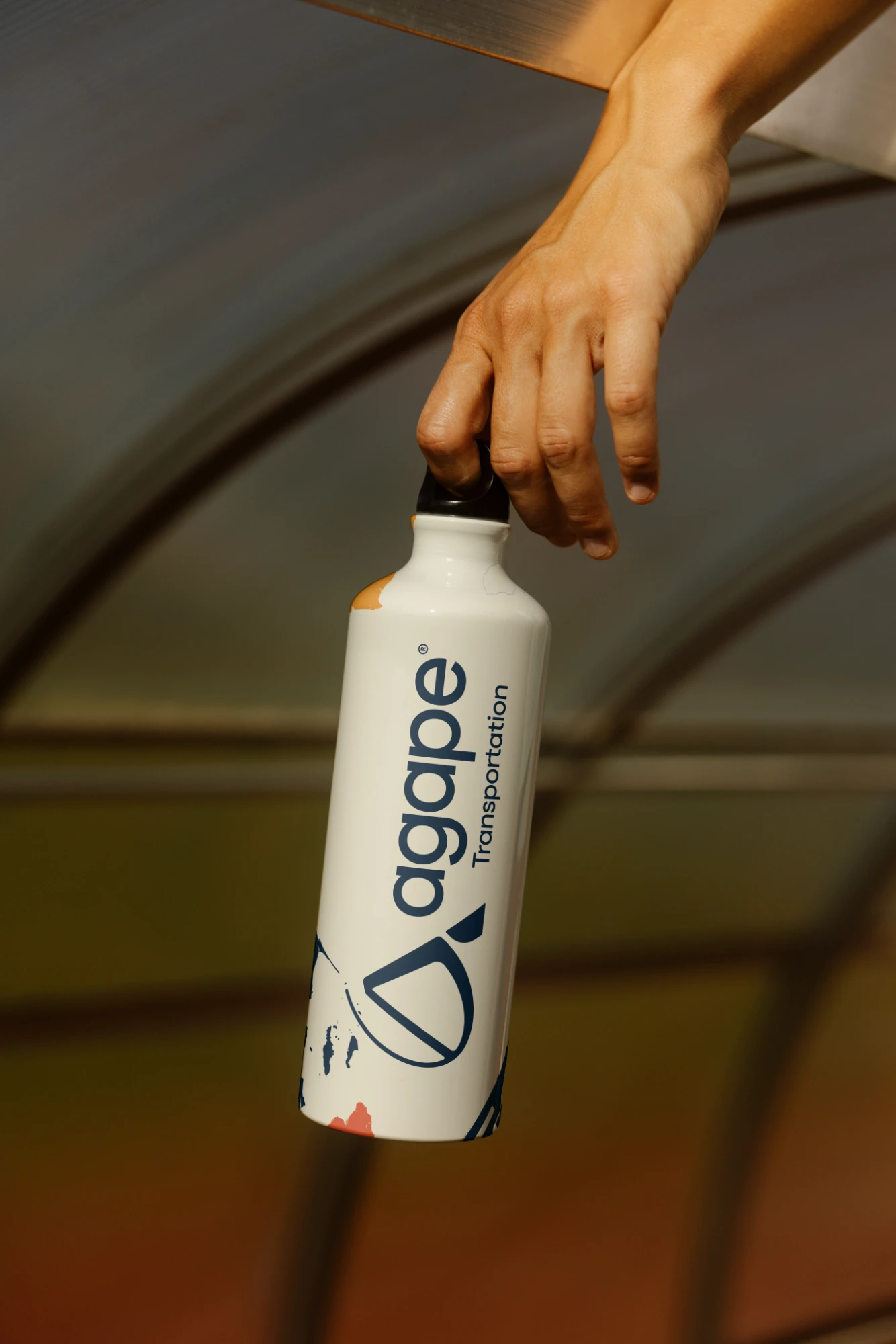
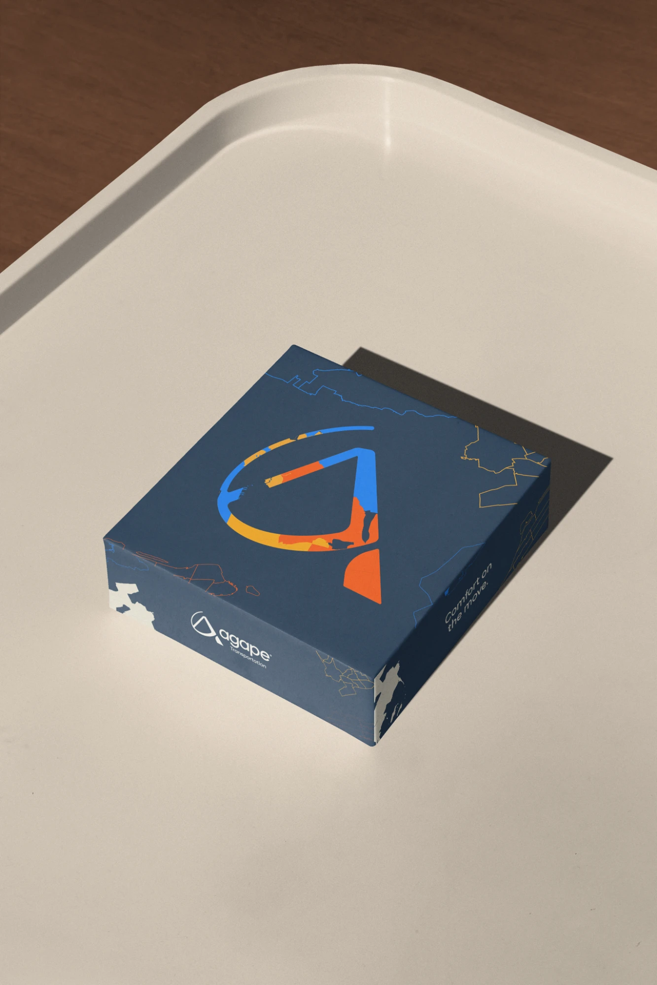
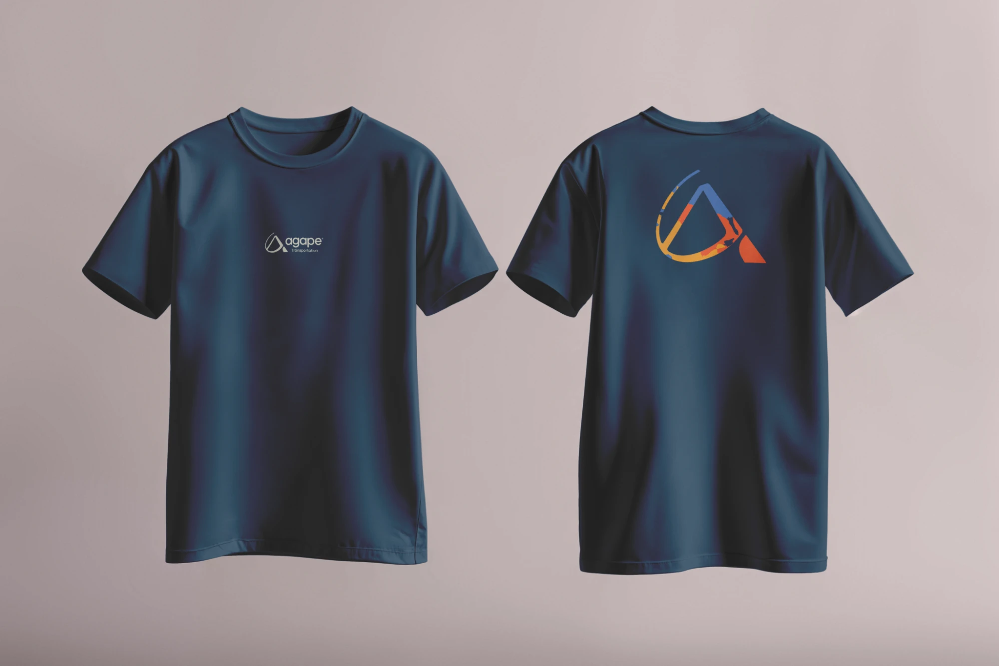
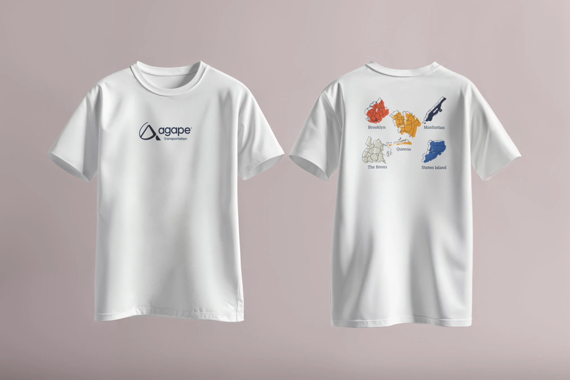
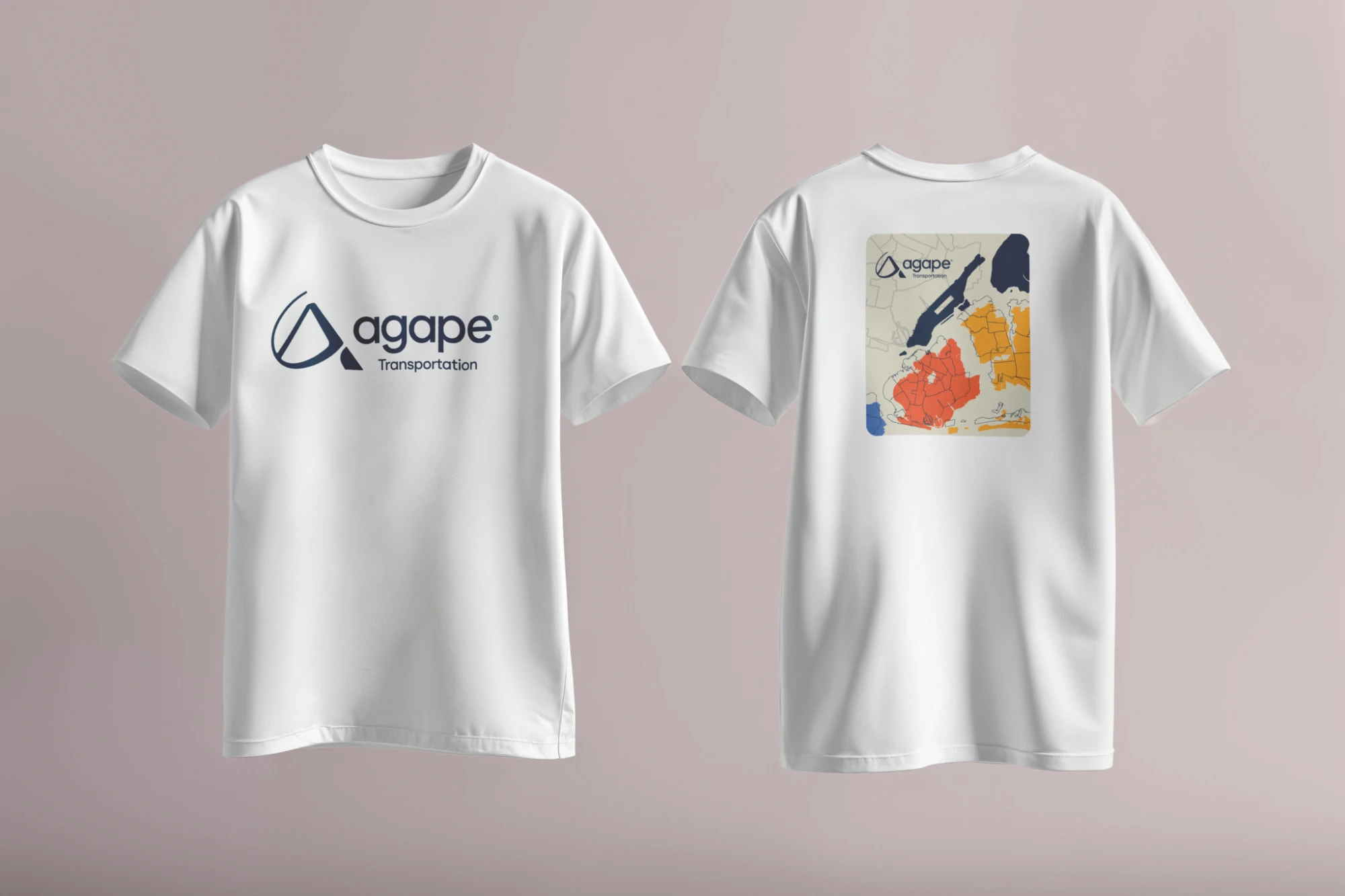
Agape Transportation has been getting New Yorkers to appointments, treatment and ongoing care since 2012, across all five boroughs and beyond. Unlike the other projects here, I didn't design this brand: the Agape identity already existed. My job was to take it off the screen and into the real world, designing a full set of brand collaterals in three weeks, from business cards and stationery to apparel, signage, packaging and a billboard.
// Project Goals
Keep the existing brand consistent across a wide range of materials. Every piece had to feel unmistakably Agape, whether it was a letterhead, a T-shirt or a billboard, while speaking to very different audiences: riders, healthcare partners and the drivers the company is recruiting.


// The Result
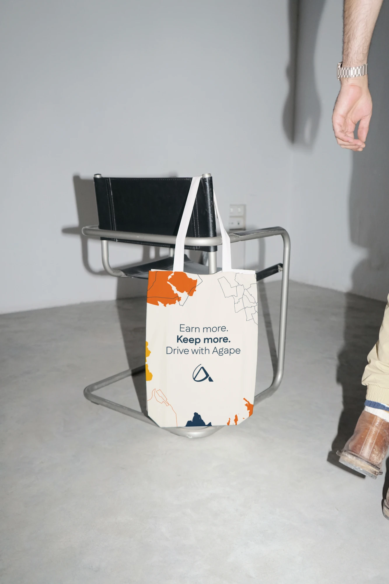
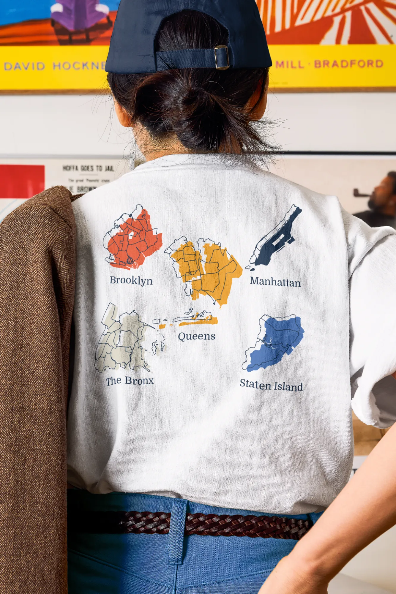
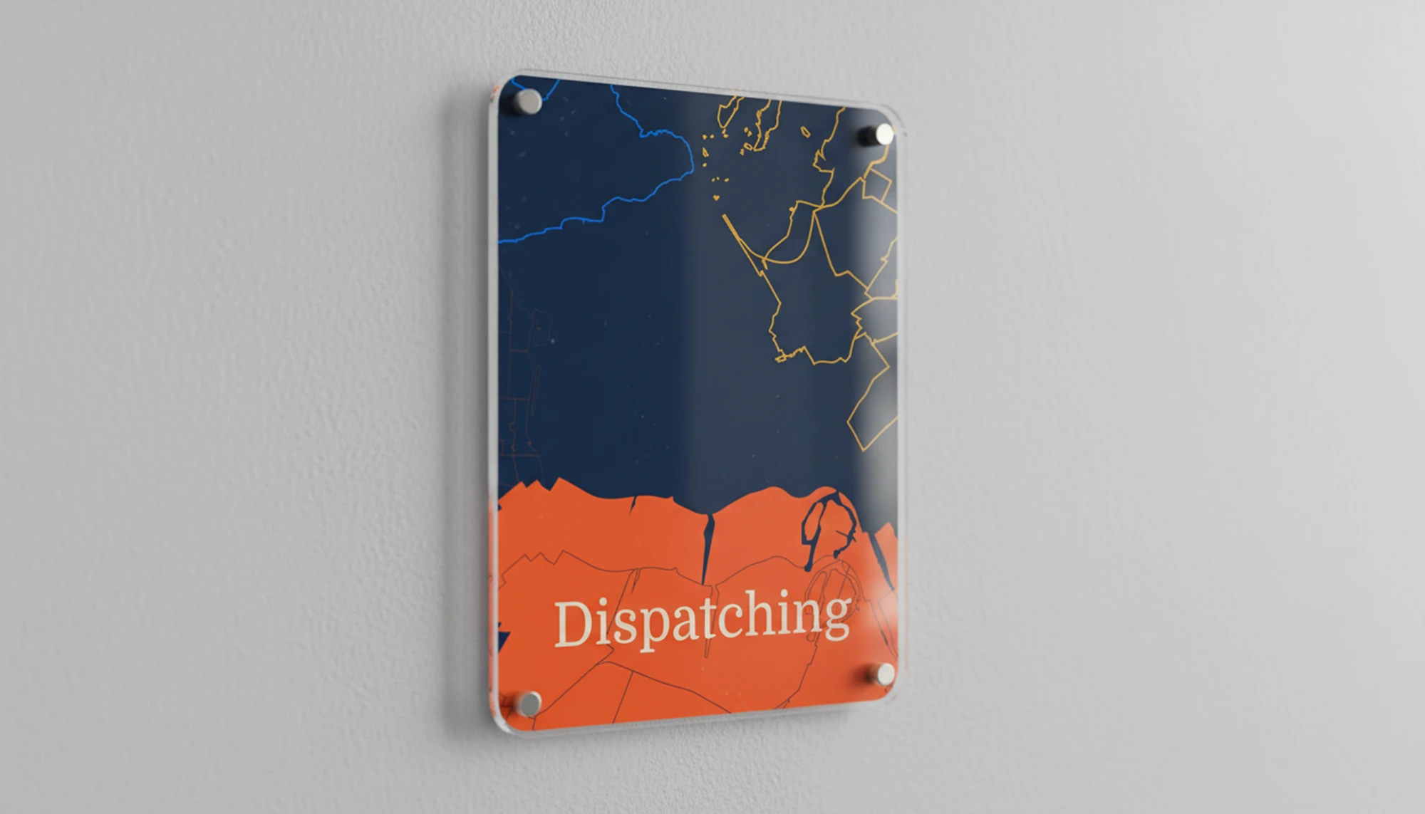
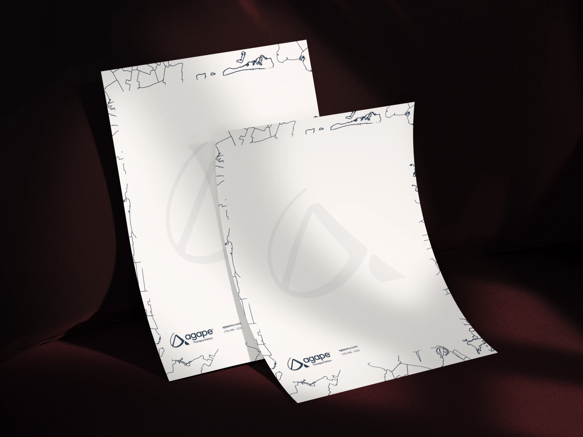
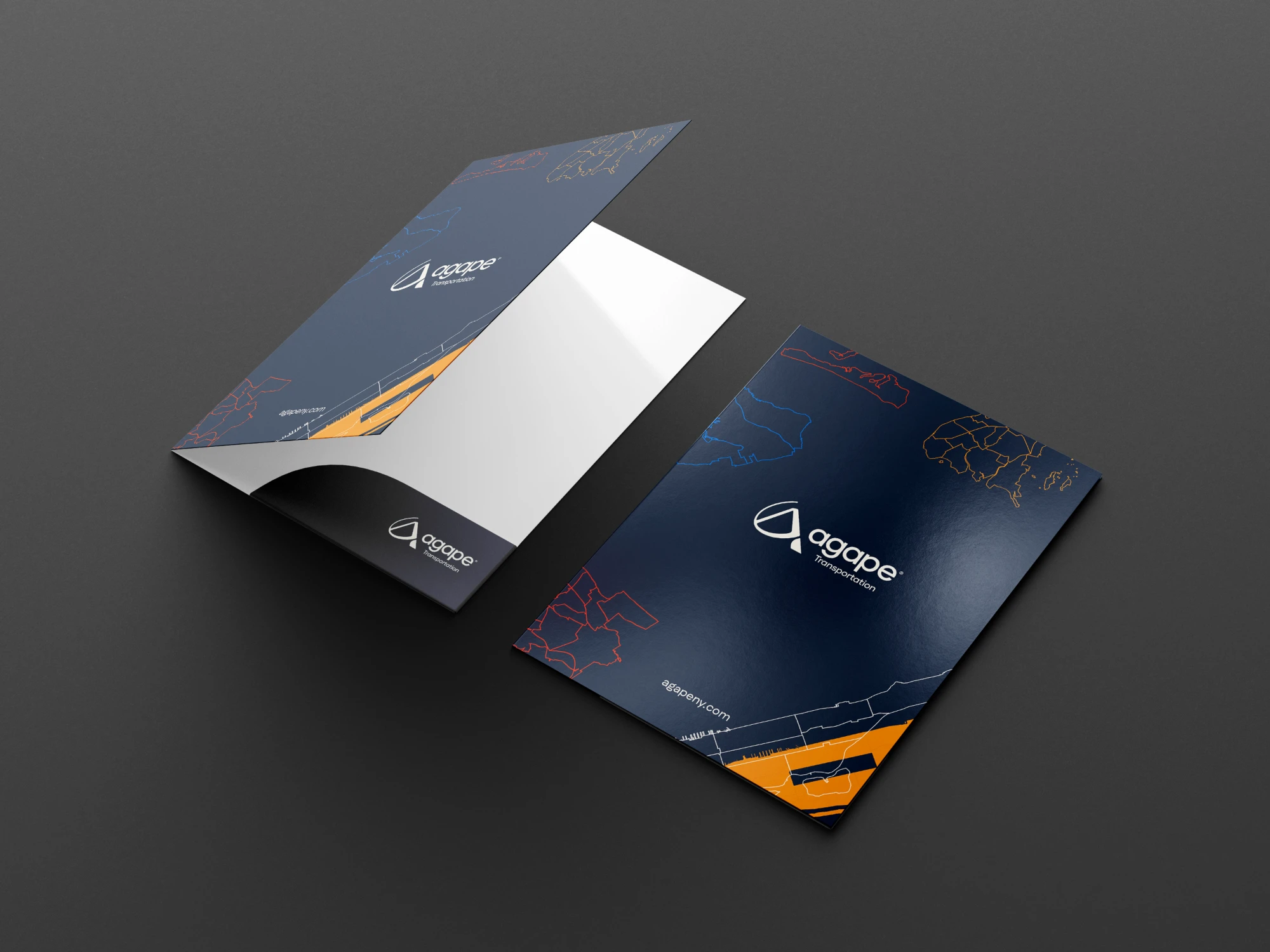
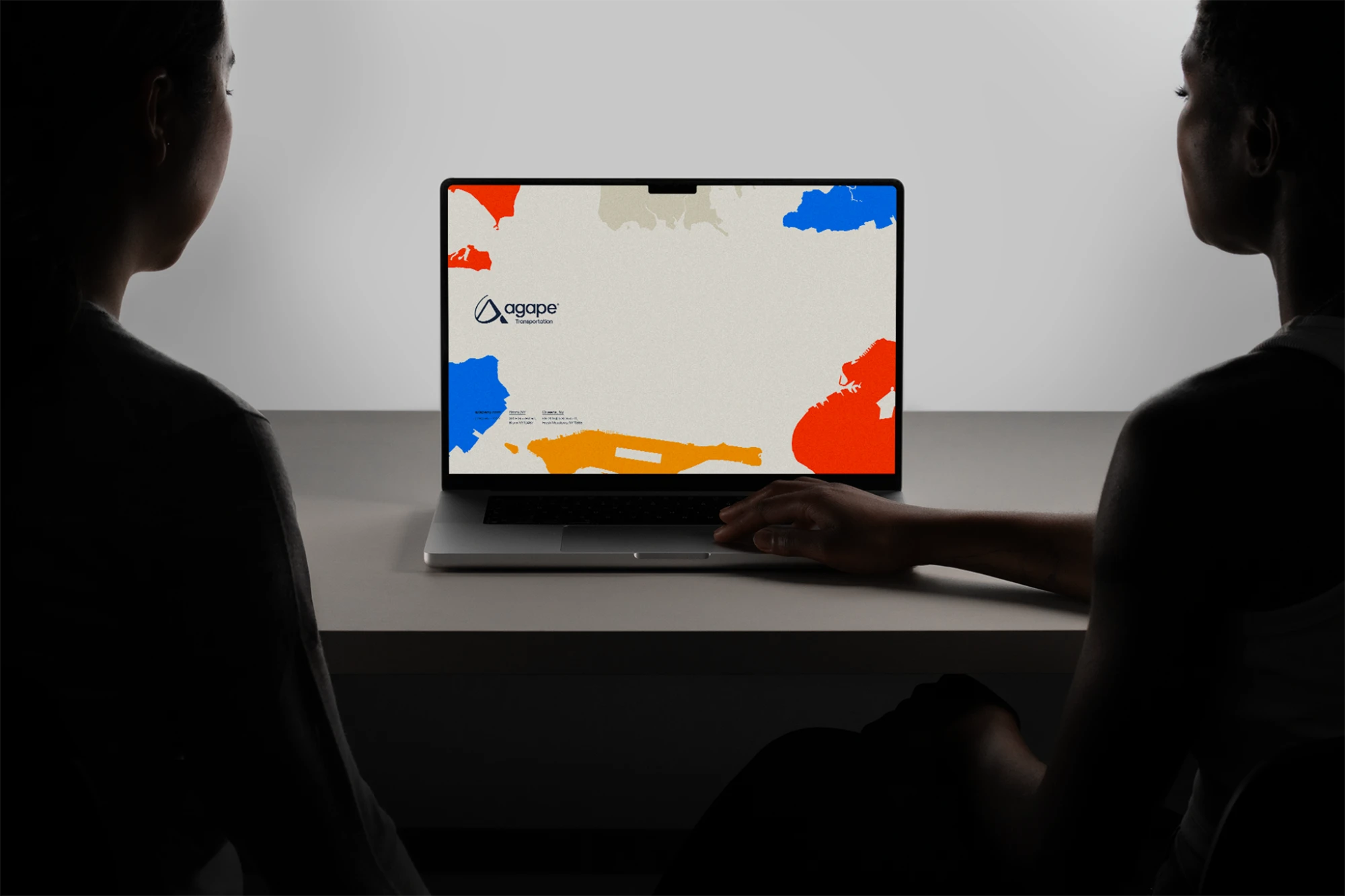
A collateral system that carries Agape's identity everywhere the company shows up. The NYC borough maps became the connecting thread: bold color fields on totes and T-shirts, fine linework on stationery and folders, and the dashed route line that links every piece, from A to B. The result is a brand that looks just as consistent on a billboard as it does on a business card.